
When a waitress places a platter of grilled prawns over crushed ice with a single lemon wedge nestled atop a bed of sea salt on the table everything on the table becomes silent for approximately two seconds. Perhaps you have experienced this yourself. It’s not because the food smells particularly good though it might but rather because everyone grabs their phones first. The entertainment has already begun but the supper has not yet begun.
That pause that instinct is the essence of what is now colloquially referred to as the seafood aesthetic. It’s a phrase that circulates on TikTok reels and Instagram hashtags typically affixed to pictures of oyster towers blackened scallops on dark ceramic or a whole branzino resting on a hand thrown stoneware platter as if it were posing for a portrait. However there is a surprisingly calculated psychology at work behind the filters and the gentle natural light one that food photographers restaurants and ceramic companies have been subtly honing for years.
| Topic | Seafood Aesthetic & Luxury Plating Psychology |
|---|---|
| Industry | Food & Beverage / Hospitality / Social Media Marketing |
| Estimated Global Luxury Tableware Market (2023) | ~$21.43 Billion |
| Projected Market Value (2032) | ~$34.13 Billion |
| Key Research | Flavour Journal (2013) — Plate color/shape and taste perception |
| Relevant Psychology | Delboeuf Illusion, Color-Flavor Expectation Theory |
| Primary Social Platform | Instagram (~85% food-related image content) |
| Reference | Oxford Academic |
Although the relationship between plate and perception is not new it has become more pronounced. When identical cheesecake was served on a white round plate as opposed to a square or black one it was rated as being significantly sweeter and more intense according to a 2013 study published in Flavour Journal. The recipe remained the same. The fork remained unchanged. The whole sensation within someone’s mouth changed along with the surface beneath.
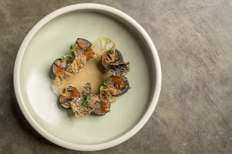
The stakes increase when you apply that discovery to seafood a category already associated with freshness the ocean luxury and fragility. On a white plate a piece of seared tuna appears tidy and accurate. On a bowl of rough edged charcoal stoneware the same cut takes on a moody almost cinematic quality. Before the first bite both versions tell a very specific story but neither is particularly dishonest.
The visual vocabulary of the seafood aesthetic is what makes it so powerful on Instagram. In contrast to say a beef stew seafood is naturally photogenic.
The vivid orange of uni the pale translucency of raw scallops the pink of salmon and the obsidian sheen of mussels all stand out against almost any background. Restaurants discovered this. The popularity of matte glazed ceramics in slate grey or dark navy wasn’t a coincidence of taste; rather it was a reaction to the way food was photographed in warm dimly lit dining rooms using phone cameras. Under flash a glossy white plate may blow out.
The seafood glows when light is absorbed by a matte charcoal bowl. Perhaps half of the trends in ceramics over the last ten years have been influenced more by how a glaze looks on a smartphone screen held eighteen inches above the table than by the tastes of chefs.
Geometry is another issue. Round plates soften everything making a dish feel approachable almost comforting. But the seafood aesthetic on Instagram tends to favor slight asymmetry an oval platter a plate with an uneven rim a bowl with a hand pinched edge. That irregularity signals craftsmanship which signals expense which signals that this meal is not casual even if you’re eating it in sandals.
The psychology here is layered. Research on plate shape and flavor perception much of it led by Oxford’s Charles Spence suggests that angular or unusual forms can actually heighten a diner’s sense of intensity and sophistication. For seafood which already carries cultural associations with fine dining and celebration the effect is almost redundant but restaurants use it anyway because redundancy in branding is just reinforcement.
portion size plays its own quiet game. The Delboeuf illusion a well documented perceptual bias shows that food looks smaller on a larger plate and larger on a smaller one. Luxury seafood restaurants exploit this constantly. Five scallops on a wide rimmed plate with negative space around them look deliberate precious worth the price. The same five scallops crowded onto a small dish might feel like a starter you didn’t order. It’s hard not to notice how often high end seafood plating leaves enormous margins of empty ceramic visible as if the plate itself is part of the dish. In a way it is.
Weight matters too though it rarely gets discussed outside industry circles. Studies on tableware and dining perception suggest that heavier plates subtly increase a diner’s sense of quality and attentiveness. A thick stoneware platter holding a lobster tail feels ceremonial. A lightweight porcelain plate with the same lobster tail might feel like catering. Ceramic brands have leaned into this producing pieces with deliberate heft knowing that the weight registers somewhere between the hand and the unconscious mind before the first forkful.
Then there’s color psychology applied specifically to seafood. Blue ceramic dinnerware has experienced a quiet renaissance partly because of its historical roots in Chinese and Dutch porcelain traditions but mostly because blue and seafood share an obvious associative world ocean coast water depth. A blue plate under a piece of white fish creates a color story that feels almost inevitable.
Consumer surveys and industry reports suggest that blue plates photograph exceptionally well and can actually enhance the perceived freshness of lighter colored dishes. There’s a sense that the plate becomes a kind of stage set not just holding thef food but locating it in a geography a season a feeling.
Social media has turned all of this from a hospitality nicety into an economic engine. According to widely cited data roughly 85 percent of images shared on Instagram involve food and a significant portion of millennials photograph their meals before eating. For seafood restaurants every plate that leaves the kitchen is now functionally a piece of marketing collateral.
The seafood aesthetic isn’t just about making food look good for the person sitting in front of it it’s about making food look good for the three hundred people who will see it on someone’s story tonight. That changes the design calculus entirely. Chefs and restaurateurs are now thinking about contrast ratios about how a garnish reads at phone resolution about whether a sauce drizzle will hold its shape long enough for someone to frame the shot.
Whether this is a cynical development or a creative one probably depends on your tolerance for performance in everyday life. Watching this unfold over the past several years it seems like something in between. The best seafood restaurants the ones whose plates actually stop you mid scroll aren’t just optimizing for cameras. They’re using visual psychology the way a good novelist uses sentence rhythm to create a feeling before you fully understand why you’re feeling it.
The plate arrives. The light catches the glaze. The fish looks almost too beautiful to eat. And for a moment before you pick up the fork or the phone you’re already having the experience the restaurant designed for you.
That more than any filter or hashtag is the real psychology of the seafood aesthetic. It’s not about fooling anyone. It’s about understanding that luxury in dining was always partly visual and that Instagram didn’t invent that instinct. It just gave it an audience of millions.
i) https://www.loman.ai/blog/the-art-of-plating-visual-aesthetics-in-cuisine
ii) https://www.hospitalitymarketinginsight.com/p/the-psychology-of-food-presentation
iii) https://www.cbhoreca.com/blue-ceramic-dinnerware/